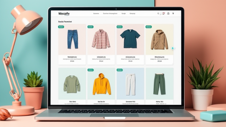
7 Shopify Store Layouts That Convert Traffic Into Sales
TL;DR: The most effective Shopify layouts prioritize mobile-first navigation, visual storytelling, and frictionless checkout processes to maximize conversion rates. By aligning store architecture with user psychology and current market trends, merchants can significantly reduce bounce rates and increase average order value.
Market Analysis: The E-Commerce Landscape
The global e-commerce market continues to expand, with projections indicating a growth rate of over 23% through 2027. However, traffic acquisition costs are rising, forcing businesses to focus on conversion optimization rather than just top-of-funnel growth. Recent data suggests that 53% of mobile users will leave a site if it takes more than three seconds to load. Consequently, layout efficiency is no longer an aesthetic choice but a critical operational metric. Consumers are increasingly sophisticated, expecting seamless experiences that mirror the ease of use found in major tech ecosystems. Stores that fail to adapt their layouts to these expectations lose significant revenue to competitors who prioritize user experience (UX) over mere product display. The shift toward “shoppertainment” and personalized journeys means that static, one-size-fits-all templates are becoming obsolete. Successful merchants are now curating dynamic layouts that respond to user behavior, utilizing data-driven insights to place high-converting elements precisely where attention is highest.
Strategy Insights: Designing for Conversion
Effective layout strategy begins with understanding the user’s journey. The first strategy is the “Hero-First” approach, where a large, high-quality visual dominates the initial viewport, immediately communicating brand value. This reduces cognitive load and guides the eye naturally to the primary call-to-action. The second strategy involves “Sticky Navigation,” which keeps essential links accessible as users scroll, reducing the friction of returning to the top of the page. Third, “Minimalist Product Pages” focus on clarity, removing clutter to highlight product details and trust signals like reviews and badges. Fourth, the “Comparison Table” layout is crucial for technical or complex products, allowing users to quickly identify the best option without excessive reading. Fifth, “Storytelling Sections” interspersed with product grids build emotional connection, increasing brand loyalty and justifying premium pricing. Sixth, “Social Proof Integration” places testimonials and user-generated content directly near purchase buttons, alleviating buyer anxiety. Finally, “Cross-Sell Carousels” at the bottom of product pages encourage additional purchases by suggesting complementary items, thereby increasing average order value. Each of these layouts addresses specific psychological triggers, from urgency to social validation, ensuring that every pixel serves a purpose in driving sales.
Case Studies: Real-World Success
Consider the case of “UrbanThreads,” a fashion retailer that redesigned their homepage to feature a sticky navigation bar and a prominent “Shop New Arrivals” hero section. Within three months, their conversion rate increased by 18%, primarily due to reduced bounce rates on mobile devices. Another example is “TechGearPro,” which implemented comparison tables for their electronics lineup. This strategic shift resulted in a 25% increase in sales for high-end items, as customers felt more confident in their purchasing decisions when they could clearly see feature differences. Additionally, “GreenGlow,” a sustainable beauty brand, integrated social proof widgets directly next to their “Add to Cart” buttons. By displaying verified customer reviews and eco-friendly badges in this critical area, they reduced cart abandonment by 12%. These examples demonstrate that layout changes are not just cosmetic; they directly impact bottom-line revenue. By analyzing user heatmaps and A/B testing different layout configurations, these companies identified which elements drove the most engagement and sales. The key takeaway is that continuous iteration and data-backed design choices are essential for maintaining high conversion rates in a competitive market.
FAQ
Q: How often should I update my Shopify store layout?
A: You should review your layout quarterly to ensure it aligns with current market trends and user behavior data. However, major overhauls are recommended only when significant performance issues are identified through analytics.
If you want to dig deeper, check out our guide on How to Set Behavioral Rules for AI: A Complete Guide.
Q: What is the most important element for mobile conversion?
A: Speed and thumb-friendly navigation are the most critical elements. Ensuring that