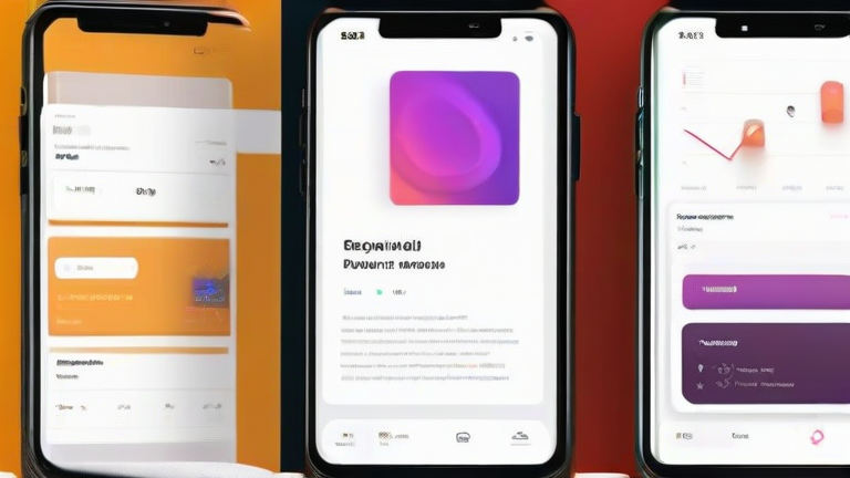
Complete Figma Tutorial: Design a Mobile App UI from Scratch
TL;DR: Start by setting up a mobile frame and defining your design system with colors and typography. Then, assemble your interface using components, auto-layout, and interactive prototypes to create a polished, functional user experience.
Step 1: Set Up Your Workspace
Begin by creating a new file in Figma and selecting a mobile frame, such as the iPhone 14 Pro preset. This establishes your canvas dimensions immediately. Next, open the Assets panel and define your primary and secondary colors, ensuring they contrast well for accessibility. Set up your text styles for headlines, body text, and captions to maintain consistency throughout the project. This foundational step saves significant time later by preventing ad-hoc design decisions.
If you want to dig deeper, check out our guide on Why I Quit Sugar: What Bothered Me & Why I Switched to Subst.
Step 2: Build the Design System
Create basic components for recurring elements like buttons, input fields, and navigation bars. Use the “Create Component” shortcut to ensure these elements update globally when modified. Apply auto-layout to these components so they resize dynamically when content changes. Group related components into styles to streamline your workflow. A robust design system acts as the skeleton of your app, allowing you to build complex screens quickly without breaking visual harmony or alignment standards.
Step 3: Design Core Screens
Start with the home screen, placing your navigation bar and primary content areas. Use the frame tool to create sections for different content types, such as image grids or text lists. Drag and drop your previously created components into place, adjusting spacing using auto-layout properties. Ensure visual hierarchy by using larger fonts for titles and lighter weights for descriptions. Iterate on the layout by duplicating frames for different states, such as loading screens or error messages. This iterative approach helps identify usability issues early in the design process.
Step 4: Add Interactivity
Switch to Prototype mode to connect your screens. Draw connections between buttons and their corresponding destination screens to simulate user flow. Add simple animations like “Dissolve” or “Slide” to make transitions feel natural and engaging. Test the prototype by clicking the “Present” button to walk through the entire user journey. Look for dead ends or confusing navigation paths during this testing phase. Refine your interactions based on this feedback to ensure a smooth and intuitive user experience before handoff.
Pro Tip: Use the “Constraints” feature to ensure elements stay aligned correctly when resizing frames. This is crucial for responsive design across different device sizes. Regularly export assets in SVG or PNG formats for developer handoff to ensure clarity and precision in the final build.
FAQ
Q: What is the best way to manage versions in Figma?
A: Use the version history feature to save labeled snapshots at key milestones, allowing you to revert to previous states if needed.
Q: Should I design for dark mode simultaneously?
A: Yes, create a parallel frame with dark mode variants to ensure your color palette works effectively in both light and dark environments.
Q: How do I share my Figma file with developers?
A: Use the Dev Mode feature to provide CSS snippets, spacing information, and asset downloads directly within the interface.