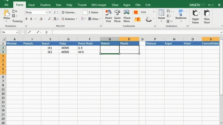
Master Excel Pivot Tables: Step-by–Sheet Data Analysis Tutorial
TL;DR: Create a pivot table by selecting your data range and inserting a pivot table to automatically summarize information. Drag and drop fields into the Rows, Columns, Values, and Filters areas to analyze trends, totals, and patterns instantly.
Step 1: Prepare Your Data
Before you begin, ensure your dataset is clean and structured. Your data must be in a tabular format with a header row for each column. Avoid merged cells, blank rows, or blank columns, as these can confuse the pivot table engine. Consistent data types are also crucial; for example, dates should be formatted as actual dates, not text. If you have a large dataset, consider converting it into an official Excel Table using Ctrl+T. This creates a dynamic range that automatically updates if you add new rows, saving you the trouble of re-selecting the source range every time.
Step 2: Insert the Pivot Table
Click anywhere inside your data range. Navigate to the “Insert” tab on the ribbon and click “PivotTable.” Excel will open a dialog box asking where you want to place the pivot table. You can choose to put it in a new worksheet, which is recommended for keeping your analysis separate from your raw data, or in an existing sheet. Click “OK,” and the PivotTable Fields pane will appear on the right side of your screen, listing your column headers as draggable fields.
Step 3: Build Your Analysis
Now, drag your fields into the four designated areas: Rows, Columns, Values, and Filters. Place a categorical field, such as “Region” or “Product Category,” into the Rows area. This will list unique values in a vertical column. Drag a numerical field, like “Sales Amount,” into the Values area. By default, Excel will sum these numbers. If you need a count or average, click the arrow next to the field in the Values area and select “Value Field Settings” to change the calculation type. You can drag another field, such as “Month,” into the Columns area to create a matrix view, allowing you to compare performance across time periods. Finally, use the Filters area to narrow down the entire table to specific criteria, such as a particular year or department.
Pro Tips for Efficiency
Use slicers for interactive filtering. Insert a slicer for key categories to create a visual, clickable dashboard that updates your pivot table instantly. Group dates by dragging the “Month” field into the Values area or by right-clicking a date cell in the pivot table and selecting “Group.” This allows you to analyze data by month, quarter, or year with one click. Remember to refresh your pivot table whenever your source data changes by right-clicking the table and selecting “Refresh.”
FAQ
Q: Why is my pivot table not updating with new data?
A: Ensure your source data is formatted as an official Excel Table. If you used a static range, you must manually adjust the source range in the PivotTable Options. Also, remember to click “Refresh” after adding new data.
If you want to dig deeper, check out our guide on Ori BOT-TX3 Micro-Apartments: Robotic Furniture Conquers Cit.
Q: Can I use multiple fields in the Values area?
A: Yes, you can drag multiple numerical fields into the Values area. Each field will create a separate column or row group, allowing you to compare different metrics, such as total sales and total units sold, side-by-side.
Q: How do I format numbers in a pivot table?
A: Right-click any number in the Values area, select “Number Format,” and choose your desired format, such as Currency or Percentage. This formatting applies to the entire field, ensuring consistency throughout the table.